The Scourge Of Terrible Video Game Logos Has Reached Street Fighter. We're Doomed
Street Fighter has abandoned its iconography in favour of a corporate-looking stamp, and fans are MAD. And frankly, so are we.

Joseph Kime
24th Feb 2022 09:34
Images: Capcom
Not to be melodramatic or anything, but a good logo is pretty f**king important.
As a staunch defender of graphic design as an art form, it irks me constantly that branding changes are never taken seriously, in gaming especially, yet completely slated when it doesn't suit fans. Take Discord's catastrophic rebrand, for example - their iconic logo changed a little bit, with a slight change to their 'blurple' colour scheme, and a change to their typeface. Pandemonium ensued.
Logos are crucial to any kind of branding whether it be company, store, or even video game - yet they're too often neglected until they're a point of complete hate or dejection. It's this dejection that has recently resurfaced, in the shape of the logo for the new Street Fighter title. The logo has been compared to that of a corporate start up, an old Adobe logo preset, the works - and fans hate it. For good reason too, as it tells entirely the wrong story about what the game is set to be.
Street Fighter's Design Is Too Iconic To Throw Away
![]()
Think of Street Fighter. Just picture it in your head. Was your first thought of the more recent titles? Or was it of the arcade cabinets of old, garnering crowds of 11-year-olds bashing the snot out of each other in Street Fighter II? Either way, a few things are constant - Ken getting battered, a Shoryuken or two, and that iconic logo casting its shadow over all of it.
The Street Fighter logo perfectly captures everything you're about to experience in the game, which was crucial at its time of launch as an arcade cabinet. The text is bold and vicious, with lines looking as though they've been torn from the sheet, giving it an immediate urban edge. It stuck out in arcades in 1991, and it stuck out on the shelves on copies of Street Fighter V in 2016. So why have Capcom changed it so drastically?
Street Fighter 6's Graphic Design Misses The Point Of Street Fighter
![]()
The logo itself has drawn a lot of attention, simply by being the least 'Street Fighter' Street Fighter logo yet. It's a clean, corporate-looking stamp that looks like it'd come printed on an envelope telling you that your taxes are overdue, and it comes with a small paint splatter in the corner with "6" in its center, which makes the image look as though it's not properly reading its emails on iOS.
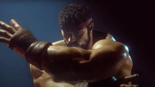
This, besides the short trailer that seemed to care more about showing us Ryu's wang than any actual peek at the game, is all we've seen of the latest instalment in one of the greatest fighting franchises in history - and being this underwhelming, it's not exactly helping players get excited. It's an idiotic move in concept alone - when the branding of Street Fighter is iconic as it is, why would Capcom ever bin it in favour of something so corporate-looking?
A game's logo is the first thing that indicates anything about a game, before even trailers and gameplay reveals - we only have to look as far as the reveals of The Elder Scrolls 6 and Metroid Prime 4 to see that. When we think of the typefaces and branding of the likes of the Zelda and Mario franchises, we can see at a simple glance that everything about these games boils down to, and is represented by, these icons. So, it bears the question - why would Street Fighter sacrifice this?
The Change In Logo Is Street Fighter 6's First Mistake
It might be unfair to say that this logo change is foreshadowing for the game's quality, and a little dramatic - but this is such a strange change that the next steps for Street Fighter 6 have become a little unpredictable. This could indicate a pretty big left turn for the series, and when we're talking about a series as competitive as Street Fighter, the controversies may have only just begun. After all, the game's graphic design isn't everything - yet, we're nervous it could be trying to leave a part of itself behind.
Street Fighter is iconic for a reason, and to leave behind its literal iconography is a move that's yet to be justified - but we'll stay as optimistic as we can. The game could yet be the best yet, and we're certainly holding up hope that Ryu's return is a bold one. Even if that logo is clapped.
About The Author
Joseph Kime
Joseph Kime is the Senior Trending News Journalist for GGRecon from Devon, UK. Before graduating from MarJon University with a degree in Journalism, he started writing music reviews for his own website before writing for the likes of FANDOM, Zavvi and The Digital Fix. He is host of the Big Screen Book Club podcast, and author of Building A Universe, a book that chronicles the history of superhero movies. His favourite games include DOOM (2016), Celeste and Pokemon Emerald.


