Which CDL Team Has The Best Branding And Online Presence?

(Opinion)
With playoffs just around the corner, the teams in the Call of Duty League (CDL) have a few weeks to shore up their strategies and plays to take a shot at the trophy before the inaugural season of the CDL concludes. With this new league almost wrapping up its first year in the history books, what better time is there to talk about the initial success of the CDL so far than right before the culmination of all that hard work and effort is put on display.
More specifically, looking at the teams themselves, how have they performed in their first couple of months as new franchises - beyond their performances in-game. I decided to scour each team’s social media to see how they’re presenting themselves and observed their visual identity as a whole, to see what they were really all about. After reviewing all twelve teams in the CDL, I’ve decided that it’s time to acknowledge the teams that are the biggest misses and biggest hits on their branding, visual design, and their online social media presence.
For an additional and more informed perspective into what about a team’s visual identity does and doesn’t work, I asked graphic designer Dale Babey (@spotdoge) to lend his expertise from four years of graphic design work to help evaluate the teams on their initial logos and visual characteristics.
 Click to enlarge
BRANDING AND VISUAL DESIGN
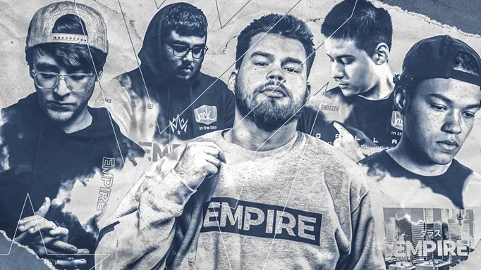
Biggest Hit: Dallas Empire
Empire’s branding and overall visual identity can be summed up in one word - fresh. Not only is black and gold a traditionally sick combination, but Dallas exudes swagger and regency, fitting of the team that’s looking to sit at the top of the CDL like the rulers of a kingdom. They may have ended only a few points away from that number one spot, but this team puts forward the confidence of “we don’t care, we’re going to take it all regardless."
Their logo is simple but distinct, exactly what a logo should be. As Dale puts it, “it’s powerful, it’s got impact”. Sneaking in the letters N and V of their parent organisation, Team Envy, is ingenious and to incorporate it to make the crown is beyond slick. The Dallas Empire have to be praised as the team with the best branding in the league.
Biggest Miss: Seattle Surge
At the very least, Surge’s branding comes off as generic, and their fonts and initial design, remind me a lot of what the late 90’s and early 2000’s pop culture thought the future looked like. The Seattle Surge’s look is less akin to a Call of Duty team and more like Zenon: Girl of the 21st Century’s favourite brand of bottled water. Their slogan, #DrownThemOut, is pretty good after you cut through the puzzling questions you have to think about when you say it out loud. “So, like, you want us to flood their homes? Oh, drown them out with the noise we make when we cheer you on… right, of course.”
Not to kick a team while they’re down, but the Surge’s look is just a misfire. Other teams might have been in the same rocky boat with their initial reveals and Microsoft Office clipart logos (looking at you Paris and London), but at least one scroll down their Twitter feeds shows that they’ve built on top of their initial lacklustre designs or have learned to incorporate other aspects of their team’s characterisation to have a better overall look.
Seattle, however, doesn't do anything new or fresh with its look. They’re not even the team with the best oceanic theme, as the Florida Mutineers blow them out of the water with their cool and incredible #FearTheDeep motif. Maybe a focus on an electrical storm surge with lightning would’ve been a better look for this team because right now it seems like they are struggling to find a look that’s better than some Challenger teams.
SOCIAL MEDIA
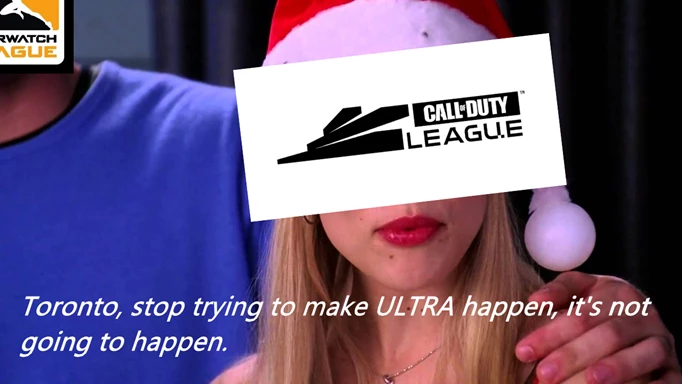
Biggest Hit: Toronto Ultra
First thing’s first, I would’ve put Toronto Ultra as a miss for branding. I know I’m calling them a hit on the social media side of things, but I have to take the opportunity to just flame them a little. Their logo is, what exactly? A squirrel? A saxophone? Their name and visuals are literally just the word ULTRA bolded and set at 48 pt. font. #SooUltra is your hashtag, really? ULTRA AS F**K on your t-shirts? Is this the Call of Duty League or Mean Girls?
 Click to enlarge
However, the more I surfed, the more I found out that the Toronto Ultra breaks the mould compared to the other teams in the CDL. Every other team in the league wants to be the cool kid. They’re a little jokey, a little laid back, they post memes and gifs like the other kids at school, but at the end of the day, everyone wants to keep up their image, to be well-liked. Every other CDL team is the kid trying to fit in at lunchtime, and the Toronto Ultra are the Pixy Stix chugging drama club weirdos that sing RENT loudly in the back of the cafeteria, living in their perfect world of unaware bliss.
Toronto’s social media is obnoxiously lit with bright purple and white graphics, filled with eccentric posts, and with absolutely no motives other than just being pure unfiltered fun. It’s bright, has no qualms with looking absolutely ridiculous, and it's incredible how much personality comes from a team that looks like it shouldn’t have any in the first place. Props to this social media team for running the best social accounts in the league!
Biggest Miss: Minnesota ROKKR
When the ROKKR get classified as the biggest miss for social media, it’s just to point out the weird inconsistency between the interaction of the team’s branding and visuals, and what’s actually posted. For Minnesota, their team is a reference to the Norse Gods, warriors ready to take on any fight. It’s Kratos on the latest God of War: cold, tough, and resilient, and up to battle any opponent. It’s the Vikings that travelled and conquered the world by land and sea, fierce fighters of the north. It’s a heavy and strong identity to build around, that you should expect to see some type of commitment to. But this is the first tweet you see on the page.
Of course, it’s not the end of the world to post tweets like that, but it is jarring to see the Viking team not be as hardcore as you think they would be.
Not trying to be mean, but you guys are supposed to be the cold Minnesota winter warrior team! You have to commit to the bit! You can’t have a ghost Viking as your logo and then ask your fans “How’s your Monday going? 😊 <3!”.
GOING FORWARD
These types of things don’t influence the gameplay of a team, but it’s oh so important for building a brand that fans engage with and recognise. For their first year, the teams have done decently so far in figuring themselves out and trying new identities. If the CDL wants to be sustainable, the teams that have built their markets, and their initial branding and social media presence, have to be able to build that, especially in an era living under COVID. Without those in-person events, a team only has their online reputation to live off, and hopefully, the other teams that have been missing the mark can keep learning on how to execute it more successfully.
All images courtesy of Activision | Blizzard
